NOTES ON AMERICAN PAINTING OF THE SIXTIES
by Walter Darby Bannard
Originally published in ARTFORUM, January 1970
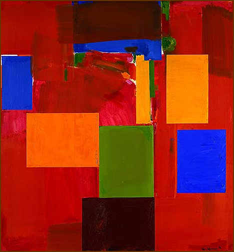
Hans Hofmann (1880-1966), Sanctum Sanctorum, 1962, Oil on canvas, 84 1/8 x 78 1/8 inches, Berkeley Art Museum, 1966.3
![]() There was a lot of painting done in the sixties. No review could describe and evaluate all of it and it is unlikely that any art writer would want to try. The first thing to do is to select the work, and usually we play the part of history, try to pick out,
at a short distance in time, art of high quality, art which will last. Give or take a few lapses, "history" is the most convincing critic, and most art writers try to stand by her side. But how does one know what is good of recent art? If you put it straight to them most members of the art public would quickly answer that there is no sure clue or giveaway. Outlines and systems for
art quality crumble as the changing tides wash them away. The only "sure thing" is a good eye. But most art writers do not have a good eye, as any history of art criticism will reveal, and they cast about for the very clues to art quality they would be the first to admit do not exist.
There was a lot of painting done in the sixties. No review could describe and evaluate all of it and it is unlikely that any art writer would want to try. The first thing to do is to select the work, and usually we play the part of history, try to pick out,
at a short distance in time, art of high quality, art which will last. Give or take a few lapses, "history" is the most convincing critic, and most art writers try to stand by her side. But how does one know what is good of recent art? If you put it straight to them most members of the art public would quickly answer that there is no sure clue or giveaway. Outlines and systems for
art quality crumble as the changing tides wash them away. The only "sure thing" is a good eye. But most art writers do not have a good eye, as any history of art criticism will reveal, and they cast about for the very clues to art quality they would be the first to admit do not exist.
![]() Everyone of the art public has a bank of assimilated taste consisting of fairly recent good art which he has been able to digest, against which he judges the new art he comes up against. He applied the lessons learned from art which has stood up to 10, 20, or 50 years of history to the art of right now.
The present generation of critics, museum directors, and the lot, endowed with a strong sense of history and a determination not to be "wrong," have been clever enough to take in not only the successes of recent art, but also the failures of past criticism as a negative guide to assure that they do not pick against history. They live with the scepter of the critic who denounced new
art which proved to be important, and these are the key words of the sixties, the all-purpose catch phrase of the eyeless art public: new and important.
Everyone of the art public has a bank of assimilated taste consisting of fairly recent good art which he has been able to digest, against which he judges the new art he comes up against. He applied the lessons learned from art which has stood up to 10, 20, or 50 years of history to the art of right now.
The present generation of critics, museum directors, and the lot, endowed with a strong sense of history and a determination not to be "wrong," have been clever enough to take in not only the successes of recent art, but also the failures of past criticism as a negative guide to assure that they do not pick against history. They live with the scepter of the critic who denounced new
art which proved to be important, and these are the key words of the sixties, the all-purpose catch phrase of the eyeless art public: new and important.
![]() History has told us that good art looks new, except for a family resemblance to the art it "outdates," and that it influences artists. This gives rise to trends and full-fledged art-making styles. We have learned our lesson well, and now, as we say good-bye to the sixties, we see newness
and importance securely fixed as safe taste. But the use of clues and signs always catches up to those who will not see art properly. The mediocre ambitious artist is always a few jumps ahead; he has a keen nose for "what's in the air" and he wastes no time bringing it into his art. It is still true that good art is new and important. What is unique to the sixties is that bad art
is now new and important. As always, bad art takes aim at assimilated taste. But it has taken until now for assimilated taste to demand these qualities. This has produced something else peculiar to the sixties: the coexistence of many very different-looking styles of art-making, each claiming to be as much "high art" as the others, each with its defenders and detractors. It was not
like that in the fifties. There were a few individualists then as now, but Abstract Expressionism was a mammoth tidal wave unlike anything we have today. These recent coexisting styles are symptomatic of the demand for newness and importance; to be new is to be different and to be important is to be generative — therefore, many styles going along parallel lines in time. The fear of being "wrong" fosters
acceptance of bad art as long as the art public is not sure it is actually bad. History has told them to go along with whatever seems to persist. And their own indecision sustains the very persistence they seek. And so we have the spectacle of mighty art institutions like the Museum of Modern Art loaded to the hatches with chichi junk, like Marisol sculpture, hideous Wesselmann paintings, the
grim idiocy of Lucas Samaras, all kinds of bobbling, clicking, flashing and wiggling things, and exhibitions of photographs of gigantic earth and sky "works" which are as destructive as they are silly. Everything has its place in this hysterical anarchy. And now, just as 10, 50 or 100 years ago, 99 percent of it is worthless. Only the superficial modes of selection have changed.
History has told us that good art looks new, except for a family resemblance to the art it "outdates," and that it influences artists. This gives rise to trends and full-fledged art-making styles. We have learned our lesson well, and now, as we say good-bye to the sixties, we see newness
and importance securely fixed as safe taste. But the use of clues and signs always catches up to those who will not see art properly. The mediocre ambitious artist is always a few jumps ahead; he has a keen nose for "what's in the air" and he wastes no time bringing it into his art. It is still true that good art is new and important. What is unique to the sixties is that bad art
is now new and important. As always, bad art takes aim at assimilated taste. But it has taken until now for assimilated taste to demand these qualities. This has produced something else peculiar to the sixties: the coexistence of many very different-looking styles of art-making, each claiming to be as much "high art" as the others, each with its defenders and detractors. It was not
like that in the fifties. There were a few individualists then as now, but Abstract Expressionism was a mammoth tidal wave unlike anything we have today. These recent coexisting styles are symptomatic of the demand for newness and importance; to be new is to be different and to be important is to be generative — therefore, many styles going along parallel lines in time. The fear of being "wrong" fosters
acceptance of bad art as long as the art public is not sure it is actually bad. History has told them to go along with whatever seems to persist. And their own indecision sustains the very persistence they seek. And so we have the spectacle of mighty art institutions like the Museum of Modern Art loaded to the hatches with chichi junk, like Marisol sculpture, hideous Wesselmann paintings, the
grim idiocy of Lucas Samaras, all kinds of bobbling, clicking, flashing and wiggling things, and exhibitions of photographs of gigantic earth and sky "works" which are as destructive as they are silly. Everything has its place in this hysterical anarchy. And now, just as 10, 50 or 100 years ago, 99 percent of it is worthless. Only the superficial modes of selection have changed.
![]() It is not possible to rightly condemn a style of art-making, just as it is not possible to rightly condemn any material for art, because it cannot be shown that a good work of art will not come up in that style. Conversely, there is no style which guarantees good art, though there have been some, like
Cubism and Impressionism and perhaps Fauvism, which at the temporal center of their effective lifetimes have allowed rather mediocre artists to paint very good paintings. But it is possible to look back on a style and say that not much has come out of it. In my experience, from what I have seen of the art of the last ten years, the styles of Pop and "hard core" Minimal have produced
nothing of sufficient quality to pass the test of time. There are works that are amusing, interesting, puzzling, works that have been influential and have inspired discussions, but nothing really good.*
It is not possible to rightly condemn a style of art-making, just as it is not possible to rightly condemn any material for art, because it cannot be shown that a good work of art will not come up in that style. Conversely, there is no style which guarantees good art, though there have been some, like
Cubism and Impressionism and perhaps Fauvism, which at the temporal center of their effective lifetimes have allowed rather mediocre artists to paint very good paintings. But it is possible to look back on a style and say that not much has come out of it. In my experience, from what I have seen of the art of the last ten years, the styles of Pop and "hard core" Minimal have produced
nothing of sufficient quality to pass the test of time. There are works that are amusing, interesting, puzzling, works that have been influential and have inspired discussions, but nothing really good.*
![]() I do think that all the really good painting of the past ten years has a direct and specific link to the great art of the recent past, will in time look much less discontinuous than it does now, and is related more by a basic sameness of process and intent than by evident visual similarity. The most striking
characteristic of the best paintings of the sixties, the factor of design which will let the art historian of the future pinpoint a work of the sixties, is the extreme spatial manipulation of the shape of the painting or of the elements of the picture surface to give color a visually plausible place on the two-dimensional abstract picture plane. Furthermore, with the exception of some painters
who persist in previous styles, I am of the opinion that all the best painting of the sixties has been made by artists who have done this.
I do think that all the really good painting of the past ten years has a direct and specific link to the great art of the recent past, will in time look much less discontinuous than it does now, and is related more by a basic sameness of process and intent than by evident visual similarity. The most striking
characteristic of the best paintings of the sixties, the factor of design which will let the art historian of the future pinpoint a work of the sixties, is the extreme spatial manipulation of the shape of the painting or of the elements of the picture surface to give color a visually plausible place on the two-dimensional abstract picture plane. Furthermore, with the exception of some painters
who persist in previous styles, I am of the opinion that all the best painting of the sixties has been made by artists who have done this.
![]() The two fundamental problems the serious abstract painter faces are those of edge and isolation; the edge must be accommodated by design because it is the strongest single factor of design of the surface, and the elements of the surface tend to become isolated across the resistant flatness of two dimensions.
Realist painting has it easier than abstract painting, and the Impressionists had it the best. Every illusion, every color, every brush stroke was fully and naturally rationalized by the character of their style. It seems that all of their problems were solved before they started painting. The problem of relating bits of colored paint across a closed-up flat surface was solved by the illusion
of realist depth, which allows the pieces to "reach" each other across the apparent void; the problem of the edge, the strongest element of design of a painting, was solved by the naturally-occurring elements of landscape—horizons, trees, waterlines, bridges, houses—all of which reflect the edge and bring it into the painting; the problem of ordering a vast and subtle variation
of colors was solved by the strict adherence to what was "seen"; the problem of the subjection of paint to the service of imitation of materials not "natural" to paint was solved by making the paintings actually consist of separate touches of paint distinctly enough to stand as paint, though they made up an illusion of another thing. Furthermore, Impressionism may have been
the only painting style to fuse the usually antagonistic approaches to art-making: constructive painting, built up from the inside, and "effect" painting, in which the paint is worked to achieve something preconceived. Impressionism gave its practitioners a firmer, stronger base for painting than any style before or since.
The two fundamental problems the serious abstract painter faces are those of edge and isolation; the edge must be accommodated by design because it is the strongest single factor of design of the surface, and the elements of the surface tend to become isolated across the resistant flatness of two dimensions.
Realist painting has it easier than abstract painting, and the Impressionists had it the best. Every illusion, every color, every brush stroke was fully and naturally rationalized by the character of their style. It seems that all of their problems were solved before they started painting. The problem of relating bits of colored paint across a closed-up flat surface was solved by the illusion
of realist depth, which allows the pieces to "reach" each other across the apparent void; the problem of the edge, the strongest element of design of a painting, was solved by the naturally-occurring elements of landscape—horizons, trees, waterlines, bridges, houses—all of which reflect the edge and bring it into the painting; the problem of ordering a vast and subtle variation
of colors was solved by the strict adherence to what was "seen"; the problem of the subjection of paint to the service of imitation of materials not "natural" to paint was solved by making the paintings actually consist of separate touches of paint distinctly enough to stand as paint, though they made up an illusion of another thing. Furthermore, Impressionism may have been
the only painting style to fuse the usually antagonistic approaches to art-making: constructive painting, built up from the inside, and "effect" painting, in which the paint is worked to achieve something preconceived. Impressionism gave its practitioners a firmer, stronger base for painting than any style before or since.
![]() The great continuing problem of abstract painting has been to build a basis for painting as strong as that of Impressionism without the illusion of reality.**
The great continuing problem of abstract painting has been to build a basis for painting as strong as that of Impressionism without the illusion of reality.**
![]() Cubism got painting into abstraction by using the Impressionist stroke to hack away at depicted subjects until the subjects were submerged under the varied inflections of relief with vestiges of the subject functioning decoratively. For reasons which I gave in detail in "Hofmann's Rectangles" (Artforum,
Summer, 1969), color was necessarily excluded from this process. When color came back to Cubist painting, in the teens, it was no longer the affective color of the Impressionists and the Fauves, but a color at the service of space, color which served to identify planes and distinguish areas. Thus it was that our first powerful abstract style sacrificed one of the natural elements of painting
(color) for an element it had to fake (illusion in space). With a few great exceptions like Matisse, that is the way it has been ever since, or perhaps it is more accurate to say that Cubism, free of affective color, has been far and away the most dominant style. Color has been forced to work itself back into the "mainstream" of painting by innovation.
Cubism got painting into abstraction by using the Impressionist stroke to hack away at depicted subjects until the subjects were submerged under the varied inflections of relief with vestiges of the subject functioning decoratively. For reasons which I gave in detail in "Hofmann's Rectangles" (Artforum,
Summer, 1969), color was necessarily excluded from this process. When color came back to Cubist painting, in the teens, it was no longer the affective color of the Impressionists and the Fauves, but a color at the service of space, color which served to identify planes and distinguish areas. Thus it was that our first powerful abstract style sacrificed one of the natural elements of painting
(color) for an element it had to fake (illusion in space). With a few great exceptions like Matisse, that is the way it has been ever since, or perhaps it is more accurate to say that Cubism, free of affective color, has been far and away the most dominant style. Color has been forced to work itself back into the "mainstream" of painting by innovation.
![]() Before I describe some of those innovations there are two questions which wait to be answered. First, why must there be affective color in painting, and second, why is it such an accomplishment to get this color into abstract painting?
Before I describe some of those innovations there are two questions which wait to be answered. First, why must there be affective color in painting, and second, why is it such an accomplishment to get this color into abstract painting?
![]() The answer to the second question must be more complex. It is twofold, part psychological and part mechanical. (Again I am obliged to say that it has been treated in greater detail in my previous essays for this magazine, particularly in "Hofmann's Rectangles.") The best and most serious artists
of any era inherit the results of the thinking of the best and most serious artists of previous eras. The trenchant authority of the Cubist style has been immense. No high-minded artist of the past 50 years has started out and matured without coming to terms with Cubism. Some, like Rothko, Newman and Still, found their own way around it, and some day it may be seen that they carried high art
through Abstract Expressionism. But the evident "mainstream," the great wave of accepted art, the expanded Cubism which is typified by the painting of de Kooning, came down on the maturing, serious artist of 1960 like the proverbial ton of bricks. The most sensitive and ambitious of them knew something was wrong, but artists are only human, and it took a lot of nerve to turn
against a style so much in power. It seemed as though every step of art-making had to be referred back to the canons of Abstract Expressionism for approval; if not, it was necessary to take another stand, more violent and rebellious: to accommodate Cubism with illustration (Rauschenberg), to mock Cubism on its own terms by arranging the interior strictly in terms of its edge (Stella)
or to go to post-Cubist symmetry to open up space for color (Noland). The only artist of the sixties to convert Cubism into color painting and make great art of it was Hofmann. Some of the reason for the eventual "takeover" of expressive color may be that it is a positive, evolutionary way to break the yoke of Cubism; certainly the erosion of Cubist picture-making by floods of color
is a most interesting process of the painting of the sixties. If it is understood what an emotional burden Cubism-Abstract-Expressionism was to the budding artist of the early sixties, we can move over to the mechanical problems intrinsic to abstract color painting.
The answer to the second question must be more complex. It is twofold, part psychological and part mechanical. (Again I am obliged to say that it has been treated in greater detail in my previous essays for this magazine, particularly in "Hofmann's Rectangles.") The best and most serious artists
of any era inherit the results of the thinking of the best and most serious artists of previous eras. The trenchant authority of the Cubist style has been immense. No high-minded artist of the past 50 years has started out and matured without coming to terms with Cubism. Some, like Rothko, Newman and Still, found their own way around it, and some day it may be seen that they carried high art
through Abstract Expressionism. But the evident "mainstream," the great wave of accepted art, the expanded Cubism which is typified by the painting of de Kooning, came down on the maturing, serious artist of 1960 like the proverbial ton of bricks. The most sensitive and ambitious of them knew something was wrong, but artists are only human, and it took a lot of nerve to turn
against a style so much in power. It seemed as though every step of art-making had to be referred back to the canons of Abstract Expressionism for approval; if not, it was necessary to take another stand, more violent and rebellious: to accommodate Cubism with illustration (Rauschenberg), to mock Cubism on its own terms by arranging the interior strictly in terms of its edge (Stella)
or to go to post-Cubist symmetry to open up space for color (Noland). The only artist of the sixties to convert Cubism into color painting and make great art of it was Hofmann. Some of the reason for the eventual "takeover" of expressive color may be that it is a positive, evolutionary way to break the yoke of Cubism; certainly the erosion of Cubist picture-making by floods of color
is a most interesting process of the painting of the sixties. If it is understood what an emotional burden Cubism-Abstract-Expressionism was to the budding artist of the early sixties, we can move over to the mechanical problems intrinsic to abstract color painting.
![]() Most of the apparently best artists accept abstraction for their art. Despite the considerable advantages of realism they assume it is better to loosen up the natural materials of paint and let them find their place. From a practical standpoint abstract painting must be relational. If a painted surface
presents any set of inflections, and is shown as art, it must be relational as long as we are directed to find art there, because whatever art it has must arise from our consideration of the variations on that surface. A non-relational painting, if such a thing is possible, would have to be unsuitable for the medium of canvas. This is why Minimal art finds its natural expression as sculpture.
There are other reasons why extremely simple art is usually also expressively limited, limited as art, but they are philosophical in nature and too demanding for this space.
Most of the apparently best artists accept abstraction for their art. Despite the considerable advantages of realism they assume it is better to loosen up the natural materials of paint and let them find their place. From a practical standpoint abstract painting must be relational. If a painted surface
presents any set of inflections, and is shown as art, it must be relational as long as we are directed to find art there, because whatever art it has must arise from our consideration of the variations on that surface. A non-relational painting, if such a thing is possible, would have to be unsuitable for the medium of canvas. This is why Minimal art finds its natural expression as sculpture.
There are other reasons why extremely simple art is usually also expressively limited, limited as art, but they are philosophical in nature and too demanding for this space.
![]() If successful abstract painting is more-or-less relational, as is indeed the case, then the parts of the painting should relate, and the few obstacles the better. This may not be necessarily true, but I take it to be self-evident. It has certainly been true in my experience as a painter and as a
close observer of painting. All of the essays to which I have been referring work around this principle, and all of the recent painting which I feel is great painting has a solidly constructed contrivance to freely relate the areas of the painted surface. If a painting is done in terms of color, that surface must be set up to allow the chosen colors to relate to each other as freely and variously
as possible. The first problem is that the flat surface to be painted naturally impedes the relationship of the "pieces" placed on it; these pieces have a hard time "reaching" each other because anything else on that surface gets in the way. It is a problem of topology, the mathematics of surface, known as the "map problem." No more than four specific color
areas can butt up together so that each share some border with another. If another color is added it automatically renders one or more of the colors to some degree remote. This gives away the built-in difficulty of relating colored areas on a two-dimensional surface. It is not the only problem facing the abstract painter but it is primary.
If successful abstract painting is more-or-less relational, as is indeed the case, then the parts of the painting should relate, and the few obstacles the better. This may not be necessarily true, but I take it to be self-evident. It has certainly been true in my experience as a painter and as a
close observer of painting. All of the essays to which I have been referring work around this principle, and all of the recent painting which I feel is great painting has a solidly constructed contrivance to freely relate the areas of the painted surface. If a painting is done in terms of color, that surface must be set up to allow the chosen colors to relate to each other as freely and variously
as possible. The first problem is that the flat surface to be painted naturally impedes the relationship of the "pieces" placed on it; these pieces have a hard time "reaching" each other because anything else on that surface gets in the way. It is a problem of topology, the mathematics of surface, known as the "map problem." No more than four specific color
areas can butt up together so that each share some border with another. If another color is added it automatically renders one or more of the colors to some degree remote. This gives away the built-in difficulty of relating colored areas on a two-dimensional surface. It is not the only problem facing the abstract painter but it is primary.
![]() The means for relating elements of a painting done in spatial terms are fairly clear to us at this time because they have been worked out in painting, most dramatically by Pollock in his paintings of 1948 to 1952. I described this in Cubism, Abstract Expressionism, David Smith (originally titled, Cubism,
Pollock and Smith), and I won't go into it here. Pollock did not do much with color because his aims in art excluded color just as Cubism did, although not in the same way. His paintings were made up of lines. Color is a fixed feature of surface. To be usefully visible color must spread out, and in spreading will cover surface. The more a painting done in terms of color goes toward a
rich variety of color, which is usually the way it happens, the more the surface will be covered and the more the colors will impinge on each other. The result is many mutually isolated colored areas with little or no openness back to the canvas. The edge is a special problem because it is the strongest factor of design of the flat surface. If it is ignored a number of problems arise, according
to the style of the painting. One of two things usually happens; either the edges cut off distinct forms which are not similar to the edge, which evokes a feeling of arbitrary design, or a painting of fairly uniform surface with not much light-dark variation turns into an object, forcing visual consideration out of the painting. Any dispersal of colors on a flat surface must make up for these
things before it can get started as a painting. All of the "color painters" of the sixties have had to face these problems and beat them. There are a number of ways to do this; the rest of this essay will describe a few of the most inspired solutions as they have appeared in the painting of the last ten years.
The means for relating elements of a painting done in spatial terms are fairly clear to us at this time because they have been worked out in painting, most dramatically by Pollock in his paintings of 1948 to 1952. I described this in Cubism, Abstract Expressionism, David Smith (originally titled, Cubism,
Pollock and Smith), and I won't go into it here. Pollock did not do much with color because his aims in art excluded color just as Cubism did, although not in the same way. His paintings were made up of lines. Color is a fixed feature of surface. To be usefully visible color must spread out, and in spreading will cover surface. The more a painting done in terms of color goes toward a
rich variety of color, which is usually the way it happens, the more the surface will be covered and the more the colors will impinge on each other. The result is many mutually isolated colored areas with little or no openness back to the canvas. The edge is a special problem because it is the strongest factor of design of the flat surface. If it is ignored a number of problems arise, according
to the style of the painting. One of two things usually happens; either the edges cut off distinct forms which are not similar to the edge, which evokes a feeling of arbitrary design, or a painting of fairly uniform surface with not much light-dark variation turns into an object, forcing visual consideration out of the painting. Any dispersal of colors on a flat surface must make up for these
things before it can get started as a painting. All of the "color painters" of the sixties have had to face these problems and beat them. There are a number of ways to do this; the rest of this essay will describe a few of the most inspired solutions as they have appeared in the painting of the last ten years.
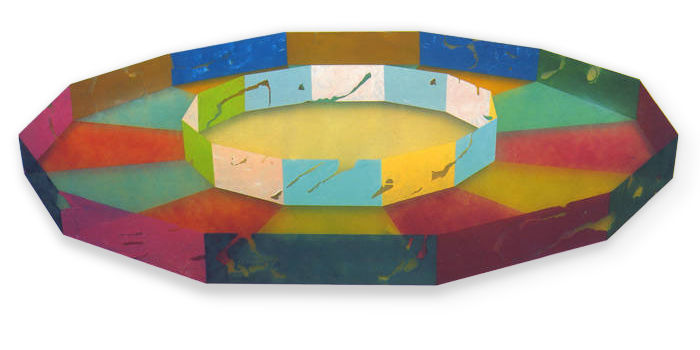
Ronald Davis, Double Ring, 1968, 50 1/2 x 132 inches (shaped), Polyester Resin and Fiberglass
![]() It is interesting that the two artists who have used this method most fruitfully are very different in age, training and background, and in a sense begin and end the decade, respectively. They are Hans Hofmann and Ron Davis. Hofmann, who died in 1965, was a Cubist-Abstract-Expressionist who did not really
flower as a painter until he was over 60. He was a great genius; in fact, I think he was the world's greatest living painter during the first half other 1960s. Davis is a young artist still tangling awkwardly with a very powerful style with which he has produced a number of brilliant works in the last two or three years. Though it seems as though Hofmann "handed the torch"
to Davis, it is clear that there is no line of influence. Instead, they both reacted to the same necessities of the art of their time. It is a case of parallel evolution.
It is interesting that the two artists who have used this method most fruitfully are very different in age, training and background, and in a sense begin and end the decade, respectively. They are Hans Hofmann and Ron Davis. Hofmann, who died in 1965, was a Cubist-Abstract-Expressionist who did not really
flower as a painter until he was over 60. He was a great genius; in fact, I think he was the world's greatest living painter during the first half other 1960s. Davis is a young artist still tangling awkwardly with a very powerful style with which he has produced a number of brilliant works in the last two or three years. Though it seems as though Hofmann "handed the torch"
to Davis, it is clear that there is no line of influence. Instead, they both reacted to the same necessities of the art of their time. It is a case of parallel evolution.
![]() Rather than fight the battle of side-by-side painted areas, as so many of his colleagues did (see "De Kooning's Retrospective" in the April, 1969, Artforum), Hofmann pulled out a specific kind of painted area, a rectangle, which by means of its even color and sharp, specific edge and shape
seems to float in front of the rest of the picture. The floating rectangle was a brilliant, one-stroke solution to the problems of edge and isolation. Because it creates a strong illusion of depth the picture surface is no longer visually two-dimensional. The rectangles and the other elements are free to take their place in front of or behind each other or at whatever depth is assigned to them
by the dynamics of the picture. By carefully balancing size, shape and color intensity Hofmann made paintings in which no part was visually isolated from any other because they could
"reach" across apparently empty space rather than across the very resistant fully-painted flat picture surface. Furthermore, the rectangles reflect the edge very strongly, accept it as an element of design and bring it into the picture. This neutralizes the insistence of the edge and has the effect of "anchoring" the painting very strongly. Since edge-reflection is forcefully
contained in one or more "free" rectangles the colors of the rest of the painting are called on to perform no prerequisite duties for design. The Hofmann rectangle painting is not made like the typical Cubist painting, by truing and fairing and aligning — that's all taken care of by the internal edge-reflection. It is made instead by adjusting the painting in terms of color and
paint: area size, value, intensity, hue, thickness, tactility. Thus, Hofmann used Cubism to leave Cubism behind, as did none of the other Abstract Expressionists.
Rather than fight the battle of side-by-side painted areas, as so many of his colleagues did (see "De Kooning's Retrospective" in the April, 1969, Artforum), Hofmann pulled out a specific kind of painted area, a rectangle, which by means of its even color and sharp, specific edge and shape
seems to float in front of the rest of the picture. The floating rectangle was a brilliant, one-stroke solution to the problems of edge and isolation. Because it creates a strong illusion of depth the picture surface is no longer visually two-dimensional. The rectangles and the other elements are free to take their place in front of or behind each other or at whatever depth is assigned to them
by the dynamics of the picture. By carefully balancing size, shape and color intensity Hofmann made paintings in which no part was visually isolated from any other because they could
"reach" across apparently empty space rather than across the very resistant fully-painted flat picture surface. Furthermore, the rectangles reflect the edge very strongly, accept it as an element of design and bring it into the picture. This neutralizes the insistence of the edge and has the effect of "anchoring" the painting very strongly. Since edge-reflection is forcefully
contained in one or more "free" rectangles the colors of the rest of the painting are called on to perform no prerequisite duties for design. The Hofmann rectangle painting is not made like the typical Cubist painting, by truing and fairing and aligning — that's all taken care of by the internal edge-reflection. It is made instead by adjusting the painting in terms of color and
paint: area size, value, intensity, hue, thickness, tactility. Thus, Hofmann used Cubism to leave Cubism behind, as did none of the other Abstract Expressionists.
![]() Ron Davis uses a different illusionistic device to get a similar effect. A typical Davis looks like a large, many-sided plastic container seen from a somewhat elevated angle. The illusion of three dimensions is very sharp and strong. As in a Hofmann, a visual deep space is created in which the colors,
in various guises, can be anchored or suspended, and can relate to one another across the apparently empty space created by the illusion. The natural properties of the smooth, transparent fiberglass surface are used to full advantage; mottled translucent areas, spots and skeins of color come up against sets of regular opaque areas which are often torn or scarred to give away some of the color
"behind." There is no edge problem because the edge is fully integrated as part of the design. Though Davis is plagued by "series"
ideas, and has yet to get a grip on the inherent monumentality of his style, he is young and inspired, and these things will evolve naturally.
Ron Davis uses a different illusionistic device to get a similar effect. A typical Davis looks like a large, many-sided plastic container seen from a somewhat elevated angle. The illusion of three dimensions is very sharp and strong. As in a Hofmann, a visual deep space is created in which the colors,
in various guises, can be anchored or suspended, and can relate to one another across the apparently empty space created by the illusion. The natural properties of the smooth, transparent fiberglass surface are used to full advantage; mottled translucent areas, spots and skeins of color come up against sets of regular opaque areas which are often torn or scarred to give away some of the color
"behind." There is no edge problem because the edge is fully integrated as part of the design. Though Davis is plagued by "series"
ideas, and has yet to get a grip on the inherent monumentality of his style, he is young and inspired, and these things will evolve naturally.
2. VARIATION OF EDGE AND SHAPE OF CANVAS, WITH REGULAR INTERNAL EDGE REFLECTION.
![]() Though the "shaped canvas" is one of the clichés of the sixties, Frank Stella, who was the first to make a big issue of it, remains the only one to handle it convincingly. He alone of the canvas-shapers keeps the inside of his picture carefully adjusted in terms of edge and size, so that
the shape of the canvas seems to be generated from within rather than applied as an element of design. In recent years he has combined his glowing colors in an illusion of shallow space by letting the colored bands surround and run in front of and behind each other.
Though the "shaped canvas" is one of the clichés of the sixties, Frank Stella, who was the first to make a big issue of it, remains the only one to handle it convincingly. He alone of the canvas-shapers keeps the inside of his picture carefully adjusted in terms of edge and size, so that
the shape of the canvas seems to be generated from within rather than applied as an element of design. In recent years he has combined his glowing colors in an illusion of shallow space by letting the colored bands surround and run in front of and behind each other.
![]() The paintings of Kenneth Noland, unlike all those above, stay resolutely flat, though an occasional unsuccessful work will "buckle."
His best work, the recent horizontal "stripe" or "band"
paintings, make no concession by means of illusion to the problems of piece-isolation. Noland's is an interesting case, probably the only one in which pure pressure of color dictates size and shape. Once committed to horizontal bands of color on a horizontally extended surface, Noland has a number of overall options open to him, besides the adjustment and variation of hue which finally "makes"
the picture. He can change the proportion of the canvas, the width of the bands and the value of the colors. It has been my experience, as a very rough rule-of-thumb with his pictures, that strong value (light-dark) variation of the colors can be maintained successfully only by reducing the number of bands, which carries as a consequence either a widening of one or more of the individual bands
or a narrowing of the canvas horizontally. Noland has painted a few paintings which violate this "rule." There are three reasons why they do not provide adequately for the thorough interaction of the colors:
The paintings of Kenneth Noland, unlike all those above, stay resolutely flat, though an occasional unsuccessful work will "buckle."
His best work, the recent horizontal "stripe" or "band"
paintings, make no concession by means of illusion to the problems of piece-isolation. Noland's is an interesting case, probably the only one in which pure pressure of color dictates size and shape. Once committed to horizontal bands of color on a horizontally extended surface, Noland has a number of overall options open to him, besides the adjustment and variation of hue which finally "makes"
the picture. He can change the proportion of the canvas, the width of the bands and the value of the colors. It has been my experience, as a very rough rule-of-thumb with his pictures, that strong value (light-dark) variation of the colors can be maintained successfully only by reducing the number of bands, which carries as a consequence either a widening of one or more of the individual bands
or a narrowing of the canvas horizontally. Noland has painted a few paintings which violate this "rule." There are three reasons why they do not provide adequately for the thorough interaction of the colors:
a) As I have said before, when color areas are widely separated across a fully painted flat surface they tend to become isolated and lose the effect of relationship. Many regular bands mean thin, distinct areas which can easily become mutually remote as they are separate in space.
b) Strong value contrast makes areas more specific as area and therefore more susceptible to isolation.
c) Because of our visual habits a large group of horizontal stripes or bands of strong value difference will separate into groups and will begin to perform the function of value difference in nature, that is, shading, so that we get an illusion of buckling or vertical unevenness, like looking head-on at a roll top desk. Then we begin to see the picture in terms of the value, or in terms of grayness, which hinders consideration of hue difference.
![]() Noland has defeated these problems with several devices. One is extreme variation of band size within a picture; another is the reduction of value difference across the picture surface. A third is an invention peculiar to Noland, which, like Hofmann's eccentric floating rectangle, is an example of the
inventive extremes an inspired artist will take when all other paths are blocked. It is the exaggerated horizontal extension of the picture surface. This makes up for separation of the colors on the surface by visually eliminating the "non-conforming" edge, by scaling down its size and importance and by sending it to Siberia, so to speak. Noland's paintings are extremely edge-reflective;
the horizontal edges are brought in over and over, but the vertical edges are not. If they were, the composition would begin to be done up in little squares and a different kind of picture would come about. If we see a thin stripe at the bottom of a canvas and another at the top we may see them as mutually isolated, but that isolation will be enhanced if we are allowed to see the actual ends
of the stripes, which gives us the information that these stripes are in fact separate units. But if these ends are held away from us we are not allowed to make this conclusion. The horizontal limits of the paintings become extended "buffer zones." We realize that the same thing goes on there as in the middle, so we direct our attention to the middle and see the stripes as integral
parts of an overall repeated pattern, the "wholeness" of which is not disrupted by snipped-off ends. This is one reason why reproductions of Noland's recent work are so inadequate, why we must see the painting before us, full size.
Noland has defeated these problems with several devices. One is extreme variation of band size within a picture; another is the reduction of value difference across the picture surface. A third is an invention peculiar to Noland, which, like Hofmann's eccentric floating rectangle, is an example of the
inventive extremes an inspired artist will take when all other paths are blocked. It is the exaggerated horizontal extension of the picture surface. This makes up for separation of the colors on the surface by visually eliminating the "non-conforming" edge, by scaling down its size and importance and by sending it to Siberia, so to speak. Noland's paintings are extremely edge-reflective;
the horizontal edges are brought in over and over, but the vertical edges are not. If they were, the composition would begin to be done up in little squares and a different kind of picture would come about. If we see a thin stripe at the bottom of a canvas and another at the top we may see them as mutually isolated, but that isolation will be enhanced if we are allowed to see the actual ends
of the stripes, which gives us the information that these stripes are in fact separate units. But if these ends are held away from us we are not allowed to make this conclusion. The horizontal limits of the paintings become extended "buffer zones." We realize that the same thing goes on there as in the middle, so we direct our attention to the middle and see the stripes as integral
parts of an overall repeated pattern, the "wholeness" of which is not disrupted by snipped-off ends. This is one reason why reproductions of Noland's recent work are so inadequate, why we must see the painting before us, full size.
3. REDUCTION OF SPECIFICITY OF SHAPE.
![]() The most specific shape is a large one which contrasts strongly with its surroundings. This kind of shape is most susceptible to the problems of isolation and edge because it inhabits an area very definitely and because the strength of its own edge forces comparison to that of the canvas. Two clear methods
to reduce the definiteness of shape are to reduce value difference between shapes and to reduce the size of shapes. Noland has made a number of horizontal stripe paintings which bring the value of the colors very close together. This induces a uniformity of surface, despite the clean-cut character of the stripes, because the absence of strong value differences lets us see the picture as a whole
unit, all at once. Hue variation is independent from value in this format and the painting can be carried by a wide range of hue within the very similar value.
The most specific shape is a large one which contrasts strongly with its surroundings. This kind of shape is most susceptible to the problems of isolation and edge because it inhabits an area very definitely and because the strength of its own edge forces comparison to that of the canvas. Two clear methods
to reduce the definiteness of shape are to reduce value difference between shapes and to reduce the size of shapes. Noland has made a number of horizontal stripe paintings which bring the value of the colors very close together. This induces a uniformity of surface, despite the clean-cut character of the stripes, because the absence of strong value differences lets us see the picture as a whole
unit, all at once. Hue variation is independent from value in this format and the painting can be carried by a wide range of hue within the very similar value.
![]() By
"atomizing" his paint, Jules Olitski has reduced the painted shape so much that it no longer figures as shape. This is a solution for color painting similar to that of Pollock's for space painting. As I have said, color must have surface, must spread out to present itself fully, and covering closes off the surface and isolates shapes. By atomizing his paint Olitski has given his surface
opaque color and transparency at the same time. If you spatter red paint on a white piece of paper, the result will be a surface occupied by red but not covered by it. If a similar shot of green is applied the same effect will be gained. The result is that the two colors extend across the surface, are visible and contrasting all over that surface, but do not literally cover it. It is not possible
for two colors to each completely cover a surface and remain visible. Furthermore, the colors get at one another in proportion to the degree of fragmentation because there is more edge-per-color available the more divided the color is. This ratio of available surface of equivalent volumes according to the degree of disintegration is a well-known fact in physics, and it works for art as well.
Olitski plays these clouds of powdered color over his surfaces just as Pollock strung out his nets of painted line, varying the concentration here and there. Though he usually keeps values close, the value differences which do exist take over through the fog, and the colors can take their place in the various shadowy depths induced by those value differences or sit opaquely on the surface.
Because of the compensations made by the other factors of his style Olitski has not chosen to go to explicit depth illusion; it is enough for him to suggest it, softly, here and there, so that we know it is there, kept in reserve, backing up the painting.
By
"atomizing" his paint, Jules Olitski has reduced the painted shape so much that it no longer figures as shape. This is a solution for color painting similar to that of Pollock's for space painting. As I have said, color must have surface, must spread out to present itself fully, and covering closes off the surface and isolates shapes. By atomizing his paint Olitski has given his surface
opaque color and transparency at the same time. If you spatter red paint on a white piece of paper, the result will be a surface occupied by red but not covered by it. If a similar shot of green is applied the same effect will be gained. The result is that the two colors extend across the surface, are visible and contrasting all over that surface, but do not literally cover it. It is not possible
for two colors to each completely cover a surface and remain visible. Furthermore, the colors get at one another in proportion to the degree of fragmentation because there is more edge-per-color available the more divided the color is. This ratio of available surface of equivalent volumes according to the degree of disintegration is a well-known fact in physics, and it works for art as well.
Olitski plays these clouds of powdered color over his surfaces just as Pollock strung out his nets of painted line, varying the concentration here and there. Though he usually keeps values close, the value differences which do exist take over through the fog, and the colors can take their place in the various shadowy depths induced by those value differences or sit opaquely on the surface.
Because of the compensations made by the other factors of his style Olitski has not chosen to go to explicit depth illusion; it is enough for him to suggest it, softly, here and there, so that we know it is there, kept in reserve, backing up the painting.
![]() Olitski is obliged to do something about the edge because the pale, close-value surface can close up and turn the painting into a big flat object very easily, and this would force visual consideration away from the painting. Internal repetition of the edge would quite evidently interfere with the quality
and mechanics of his surface. But the atomized shape is so subdued as shape, the colors so delicately uniform across the surface, that strong edge-repetition is not needed; there is nothing inside the painting which calls for it. Olitski simply brings the edge in along one side, or goes around a corner, by masking off a value difference or by drawing a rough and often highly colored line. This
declares the painting as a painting, stays out of its "body"
and carries in other colors.
Olitski is obliged to do something about the edge because the pale, close-value surface can close up and turn the painting into a big flat object very easily, and this would force visual consideration away from the painting. Internal repetition of the edge would quite evidently interfere with the quality
and mechanics of his surface. But the atomized shape is so subdued as shape, the colors so delicately uniform across the surface, that strong edge-repetition is not needed; there is nothing inside the painting which calls for it. Olitski simply brings the edge in along one side, or goes around a corner, by masking off a value difference or by drawing a rough and often highly colored line. This
declares the painting as a painting, stays out of its "body"
and carries in other colors.
![]() There is a "feel" about these mechanics which I can't put properly into words. When I think hard about these paintings, as I have, some of these simple, seemingly arbitrary solutions to pictorial problems jump up and become more than they really are, become human. Hofmann's rectangle, Noland's
stretched-out canvas and Olitski's random edge decoration all have that sense of mental "leap" which scientists describe when, after years of pushing and straining at a problem the answer comes down out of nowhere in all clarity. The effect is different, because to the scientist the answer is the result, while to the artist it is only a kind of license to get along and show his stuff.
But there is a sameness of the quality of thought.
There is a "feel" about these mechanics which I can't put properly into words. When I think hard about these paintings, as I have, some of these simple, seemingly arbitrary solutions to pictorial problems jump up and become more than they really are, become human. Hofmann's rectangle, Noland's
stretched-out canvas and Olitski's random edge decoration all have that sense of mental "leap" which scientists describe when, after years of pushing and straining at a problem the answer comes down out of nowhere in all clarity. The effect is different, because to the scientist the answer is the result, while to the artist it is only a kind of license to get along and show his stuff.
But there is a sameness of the quality of thought.
![]() These are other artists of the sixties who have painted very good paintings with other means. Helen Frankenthaler, for example, compensates for edge and isolation by lining up her images with the edge and by keeping the colors bright, the areas simple and separate and the space wide open. The color areas
are strong and distinct and relate easily across the unmodulated raw canvas. Larry Poons, though he has changed his style very much recently, is best known for his paintings of small, regularly arranged colored dots or ovals on a colored surface. According to the picture, these colored bits are surrounded by the colored surface or, because they can be organized into precise systems across the
surface, jump in front of the surface as separate entities, as if each set of dots was laid out precisely on a sheet of clear plastic held up in front of the colored canvas. There are many other very fine painters I have not brought up here because this essay is about techniques, not artists; it is about a few of the methods some artists have used to get color into their painting and it is
not meant as a compendium of good artists. Furthermore, the use of these art-making procedures does not insure art quality. Though apparently necessary, they are only foundations. My point is that no matter how wild it looks, great art is always securely built. These are notes about the strength of the skeleton, not the beauty of the flesh.
These are other artists of the sixties who have painted very good paintings with other means. Helen Frankenthaler, for example, compensates for edge and isolation by lining up her images with the edge and by keeping the colors bright, the areas simple and separate and the space wide open. The color areas
are strong and distinct and relate easily across the unmodulated raw canvas. Larry Poons, though he has changed his style very much recently, is best known for his paintings of small, regularly arranged colored dots or ovals on a colored surface. According to the picture, these colored bits are surrounded by the colored surface or, because they can be organized into precise systems across the
surface, jump in front of the surface as separate entities, as if each set of dots was laid out precisely on a sheet of clear plastic held up in front of the colored canvas. There are many other very fine painters I have not brought up here because this essay is about techniques, not artists; it is about a few of the methods some artists have used to get color into their painting and it is
not meant as a compendium of good artists. Furthermore, the use of these art-making procedures does not insure art quality. Though apparently necessary, they are only foundations. My point is that no matter how wild it looks, great art is always securely built. These are notes about the strength of the skeleton, not the beauty of the flesh.
![]() Despite all the "new" materials brought into art and the consequent silly talk about the decline and imminent death of painting, I think we are just getting started, that in the sixties we have taken the first moves of the first great burst of real abstract painting. The new art, its roots deep
in the great art of the recent past, will leave behind it the frivolity and fussiness of the fad styles of the sixties and the puritan restrictions of Old Mother Cubism. It will be as bright as it is balanced, as permissive as it is secure, a natural art embracing all the natural materials of painting, an American analog to the beautiful painting of the French Impressionists a hundred years
behind us.
Despite all the "new" materials brought into art and the consequent silly talk about the decline and imminent death of painting, I think we are just getting started, that in the sixties we have taken the first moves of the first great burst of real abstract painting. The new art, its roots deep
in the great art of the recent past, will leave behind it the frivolity and fussiness of the fad styles of the sixties and the puritan restrictions of Old Mother Cubism. It will be as bright as it is balanced, as permissive as it is secure, a natural art embracing all the natural materials of painting, an American analog to the beautiful painting of the French Impressionists a hundred years
behind us.
*
I will not try to justify this flat statement (except to ask the reader to refer to my article, "Present-Day Art and Ready-Made Styles" in the December, 1966 issue of this magazine) because I have confidence that time passing will do the job for me. This is also a good point to say that this essay is based on a lecture I gave recently, and is more general and less tightly worked-out than my other writing in this magazine. In the form given here it is an outline, full here and thin there, which could and perhaps should be made complete in time to come.
For an excellent discussion of the taste of the art public, which I only touch on here, try to get hold of Clement Greenberg's "Avant-Garde Attitudes," a pamphlet printed by the University of Sydney, Australia. It has not been published in this country and may be hard to get, but it is worth the trouble.
**